I’m always surprised by how much you can do if you set your mind to it. Painting thirty pieces in one month is an awful lot! This year I spend a little more time to prepare this challenge, as I knew it would be hard to combine with a full-time job. In return, I would learn new things about painting though! Let’s review my experience of Plein Airpril 2025 and share my learnings.
What is Plein Airpril?
Plein Airpril is a yearly online challenge hosted by Warrior Painters, a collective of California-based artists organising workshops and classes. Most of its members are working in animation, so the material is geared towards the skills you need for those kind of jobs. As you need a good understanding of light and colour for visual development and background design, plein air painting has been a regular study excercise for artists.
The challenge was held for the first time in 2017 to celebrate Earth Day (22 April). The goal of Plein Airpril is to challenge and engage with plein air artists across the globe and to encourage them to share their artworks—one per day—during the month of April. In previous years there were prizes to be won (the event had sponsors), this year there were painting demos for students enrolled in Warrior Painter classes.
The term plein air is derived from the French en plein air, which means outdoors. Painting outside was relatively unheard of until the impressionists made it their core practice. This was possible though the invention of the paint tube: with premixed paint, oil painting became a lot more portable.
Nowadays it’s never been easier to paint outdoors; look at me working from my Ipad! I feel Warror Painters does prefer working traditionally slightly over digital (there were slightly more demos in traditional media than digital during this year’s challenge), but everything is allowed. There are artists who create whole scenes in Blender for this challenge.
I’ve completed the challenge once before in 2022. For this year, I had a few specific goals in mind to help me complete Plein Airpril while working full time.
The goals
I’ve set two (and a half) goal for this year’s Plein Airpril challenge:
Limit the time for each painting to around 1 hour
Try to simplify shapes, textures, etc as much as possible
I also wanted to paint more works traditionally (to be specific: in gouache), but I knew this would be very hard given my little free time. And it was: only four out of thirty were created in gouache, and two in watercolour.
Working digitally has spoiled me: I never had to account for the time it takes to mix colours. Add to that that I’ve only recently picked up gouache again, and the bar was simply set too high. If the goal was to do a painting every week, I believe I could make it work – a daily challenge is yet unfeasible for me.
The other goals, however, felt quite reasonable to me!
The 1-hour limit
Finish in one hour? Easy!One hour?! I had only just blocked in the town hall!
One hour per painting quickly turned out to be way too little time. For natural landscapes, I was able to finish them within little more than one hour. These paintings didn’t feel very challenging to me: natural shapes are much more forgiving if you don’t get them exactly right.
Plein Airpril is about trying new things though, so I wanted to do a couple of city scapes too. They proved to be huge time sinks: those paintings took easily 2 to 3 hours per piece and I do admit I worked on most of them over multiple days. These paintings were the main reason I couldn’t keep up posting every day.
I had created a few paintings beforehand, as a backlog for the days I did not manage to finish the piece on time or had other obligations. This worked out great during the first few weeks, but I ran out of spare pieces I the second half of the month. It was exactly then that I started to drift.
As Procreate lets you see how long the file has been open, I can plot all paintings against the time it took to paint them (traditional pieces are guesstimates):
You can see that the gouache paints took the longest, not counting April 23th. But that doesn’t mean digital paintings take less time by rule: twice as many digital paintings passed the two hour mark (8) than staying under the limit (4). On average, I spend a good 1 hour and eleven minutes on each digital painting. For a gouache painting, I needed 2 hours and 45 minutes on average.
I could conclude that one hour is too short for me to finish a painting, though sometimes I can. However, allocating more time for these paintings means I have to get up early or stay awake longer – both things which are not going to make this challenge easier. I believe it is still a good time to strive for, even though I know I won’t always make it.
Simplifying shapes
Luckily, I do feel I succeeded in this goal. I have tried simplifying through leaving out details as well as using texture to suggest detail. Both approaches work for different subjects: The former lends itself well for city scapes and man-made objects, while the second is great for natural landscapes and foliage.
In my newsletter I referred to these approaches as the ‘flat style’ and the ‘scribbly style’, though in the process of painting they only started to become deliberate choices towards the end of the month. Still, I believe it’s great to become more concious of how I’d like to paint my subjects rather than copying what’s in front of me!
Another thing I paid extra attention to in my paintings is edge control: which shapes do stand out clearly and which ones diffuse into each other? Taking this into account, I could create a much better focus into the painting.
The photo reference folder
In order to make the daily painting go as smoothly as possible, I had prepared a folder of thirty photos I could paint if I couldn’t work plein air (which was probably going to be 90% of the days).
The subject’s nothing special, but the atmosphere!
It sure was helpful to have a stack of photos to go through, but I didn’t depend on it as much as I thought I would. In fact, a a lot of the paintings I did where of photos I took the same day or a few days back. I believe this adds to the plein air vibe – one of the reasons I love painting plein air is that your subject matter can be super mundane and you can still create a great piece of it.
Still, if I do this challenge next year, I will too prepare photos to paint from. It’s like a safety net: I have photos to fall back upon if I can’t find a nice subject around me.
Lessons learned
Plein Airpril is a tough challenge, but the results are so worth it.
I love it because it focuses solely on self-improvement and the joy of painting outside. Within the framework of regular plein air painting, you can set your own goals and work at your own pace. With 30 daily paintings, everyone will see growth, even the most seasoned professionals. There’s really something to gain for everyone.
I have done the challenge before, but doing it again proved once again that there’s always more to learn. I realise more and more that plein air painting is not so much about depicting what you see, but more using it as input to tell your own story.
What did you do during Christmas holidays? I made a sketchbook out of the typical blue envelopes the Dutch tax authortity sends – the Belastingdienst. For Dutchies, ‘blue envelope’ is synonymous with news from the tax autority and therefore not a welcome sight in the mailbox. Ironically I do love my newbound sketchbook made of these!
Austin Kleon once called the days between Christmas and New Year’s Eve a no-man’s land – and it is a very weird period of the year. I oftentimes find myself picking up old hobbies or playing games I’ve abandoned for years during these days. This year, I decided to do something with all the blue envelopes I’ve been accumulating during the years.
The Belastingdienst sends out letters at least four times a year, and I always kept the blue envelopes. I find it a nice neutral tone to draw on, and being basically scrap, there’s no pressure of having to create something that’s actually nice. But the frequency of the letters is higher than I’m using them for drawings, so there was quite a pile waiting for me to use.
So I decided to bind a good amount into a sketchbook, so I might use these papers more. I didn’t make any progress photo’s – on purpose actually. I wanted to enjoy creating it and not worry wheter I would share it or not. So you’ll have to do with the end result unfortunately!
I’ve used a Coptic stitch to bind the book, which might be a bit of a weird choice seeing that I wrapped the back and cover in red paper. Coptic is usually all about an open spine. I chose it because it’s one binding technique I’m famililar with, and sewing the covers onto the book block hopefully helps the book stay longer together. Fellow artists will know, sketchbooks usually go through a lot – my store-bought ones need tape too before they’re filled! Leaving the spine open, however, would mean sunlight would directly hit the inner pages when stored on the shelf, and I already know the blue colour is anything but lightproof. Adding a bit of spine seemed best, though I’m certain the red paper will also fade though.
The spine is not much more than a few strips of tape and a bit of cardboard underneath the red paper. I was worried if I made it too stiff, the book wouldn’t open flatly – another reason why I love coptic bindings. The drawback is that the spine folds when the book is opened, and it might tear after much use. Still that’s part of the fun of making things yourself, I think!
Apart from the envelopes, most other materials are recycled as well. The board used for the cover was the backing board of a block of paper, the red cover leftovers from Christmas wrappings. I’m a hoarder of scrap materials – now they come to good use!
The envelopes are all teary from opening them, but cutting them straight would make the book quite a bit smaller. So I made the cover slightly bigger to protect the pages.
Next time I might choose a proper hardcover technique, but I think this is a nice substitute.
I’ve been part of the Potato Painters Discord for over a year now, but I never attended one of their events. Until now!
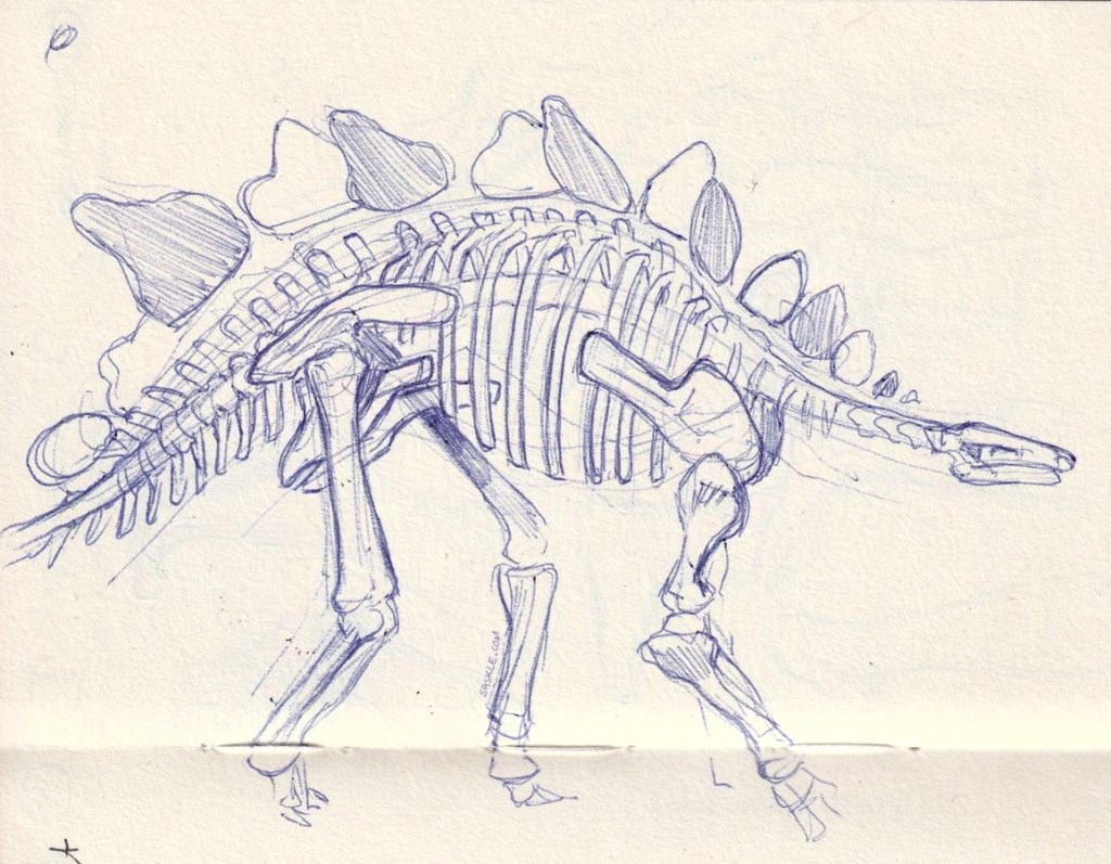
Potato Painters is a Discord server for artists who like to draw and paint on location. Having become such a plein air enthousiast the past years, this seemed like the perfect community for me. Unfortunately, most gatherings have been organised during weekdays or weekends I already had made plans for. When the idea came around to draw at Naturalis’ new Triceratops exhibition in a week I already had off, I took my chance.
It turned out there were only three of us drawing that day, but it didn’t bother me – a smal group means you get to know each other better. After all, I like to visit these events for meeting new artists just as much as creating an appointment for myself so I have to show up and draw.
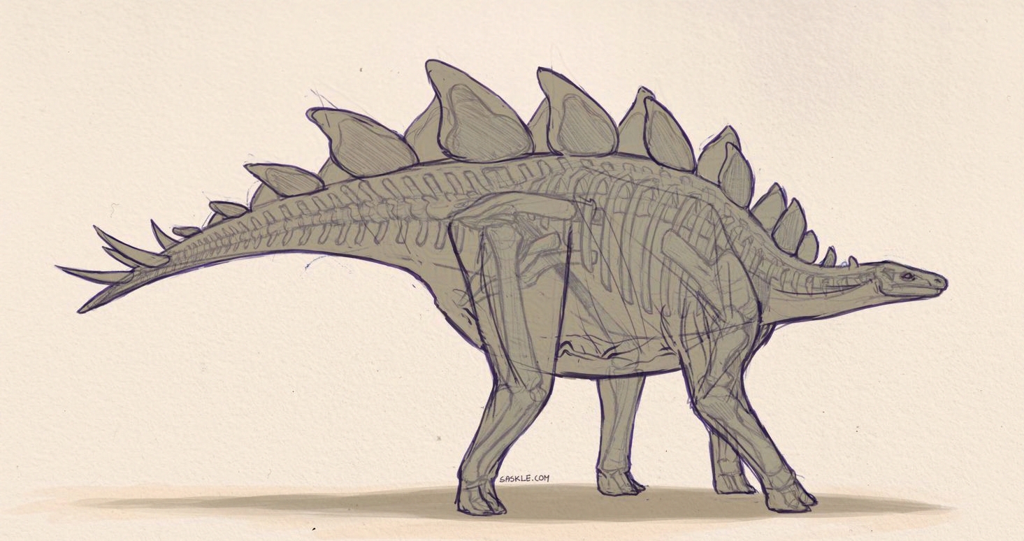
I had never drawn dinosaur skeletons from life before, and it was just as much as a challenge as I imagined. On the other hand, it isn’t very different from drawing anything else – the same rules apply: simplyfying the general shapes, getting proportion right first, and so on. I got Terryl Withlatch’ The Science of Creature Design for Christmas, so I had already spend some time studying anatomy. It helped recognising some bones, as vertebrates (specifically tetrapods) have a very similar basic skeletal structure. Still, the shape and proportions of each bone vary greatly!
One museum worker was so kind to point out that the Stegosaurus on display is an older copy, having the tail mounted low as if it would drag over the ground. Nowadays, scientific consensus holds that dinosaurs held their tails up in the air, which inspired me to take my Stegosaur sketch and update it more recent insights.
The actual muscluature and volume is speculation, I’m no trained paleoartist – but it is fun to try and understand such a creature this way!
The bane of my existence during high school’s art class.
As a teenager I loved the art classes we had, but there was one perculiar thing that frustrated me: our painting set included magenta as a primary colour instead of red. No matter how hard I tried, I couldn’t mix vibrant reds or oranges with this colour.
In art school I no longer encountered this issue – there were no prescribed palettes or colour theory classes. In the one painting class I had we were asked to bring a classic palette of titanium white, process black, yellow ochre, burnt umber, cadmium red, lemon yellow and ultramarine. No magenta or rose. I never had any issues mixing colours I needed.
So I had forgotten about my irritations until I read an Instagram post from a Dutch drawing magazine. It stated:
Did you know you can mix all colours with just a cyan, magenta, yellow, black and white pencil?
Naturally, I was sceptical. I had a completely different experience in my art classes, even though I know magenta, cyan and yellow ink print most colours just fine from my printer. If the theoretical primary colours work for printing ink, why doesn’t it for my paint? Are coloured pencils that different? Was it the brand we were using? Is it my technique?
So, to figure out what was the problem I decided to test this using different materials: the pencils mentioned, watercolour, and of course the dreaded gouache.
Get ready for a deep dive into colour!
Challenge accepted
A little disclaimer is in place here: colour perception is extremely subjective. What I call red might be more like orange to you, let alone that I know for sure that you will perceive the same colour as I do. Add to that the fact that I have to scan and photograph my paints and pencils, which adds another layer of complexity. I do hope, however, that you’ll see the same differences as I do, and that all this is still valuable to you!
To begin, I mixed swatches of magenta with yellow and compared it to ‘true’ red. I use Winsor & Newton CotmanWater Colours, Caran d’Ache Pablos coloured pencils and Royal TalensGouache for these tests.
Apart from gouache, my materials didn’t call any of their colours ‘magenta’. I used my own judgement to pick a colour closest to primary magenta, you will inevitably have differrent results using different colours.
What did I learn? Well, comparing to a ‘true’ red, the red mixed by magenta and yellow doesn’t look too bad in watercolour. It appears to be less vibrant, but it’s close enough that I would call it a worthy substitute if one has no acces to ‘true’ red pigments.
Coloured pencil is a whole different story, however. I couldn’t get Carmine and Yellow to blend into something reddish, compared to Scarlet. The Pablos are not the softests pencils around, but not the hardest either.
And in gouache, well… It comes near something reddish, but comparing with vermillion it appears dull. Exactly like I remembered it.
In a straight comparison, ‘true’ red wins 2 out of 3.
In order to put magenta really to the test, I need to compare it in relation to different colours. After all, most paintings will have more colours than just red or orange.
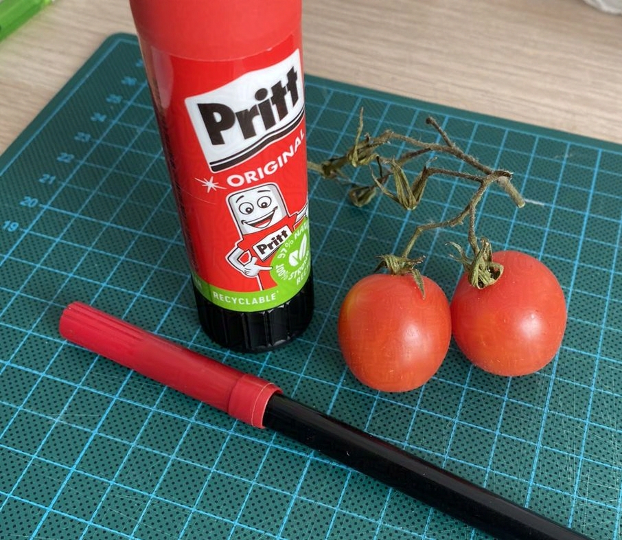
Tomatoes and glue
I figured the best way to test magenta’s mixing abilities would be to paint objects of various red shades. So I put a few red objects together with green for good colour contrast, picked three ‘primary’ colours for each medium, and started painting.
I decided not to use black pencil or paint in these tests, as it wouldn’t make a difference for mixing red from magenta and yellow. One could argue you need black to mix less saturated, more neutral shades, I’ve always liked to use complemetary colours to create neutrals.
Watercolour
In watercolour, magenta and yellow make a fine red, or at least something that fully ‘reads’ as red in a scene. With just these colours, however, the deep orangy-red of the tomatoes is not quite the same colour as in real life (though I admit it does look close in the scan compared with the photo). The yellowish deep green of the branches is also hard to match with this set.
I’ve written before that you don’t need an exact colour match to get ‘realistic’ colours in a still life or plein air scene. If the values are good and the colours are close enough, we will read the colours as right. Though that doesn’t mean you have to settle for ‘not quite’: in the second painting the colour of the tomatoes is a closer match. The green on the glue and the tomatoes’ leaves looks more like in real life. The background, however, is much duller: ultramarine is a much weaker blue. Also, the pinkish felttip is also far less saturated.
In my opinion both sets of ‘primary’ colours have their strenghts and weaknesses, you should pick which one fits your needs – or use all six colours!
Coloured pencils
In this scene the coloured pencils performed better than in the swatches. The tomatoes and glue do read as red. But when it comes to true accuracy, it’s not really close.
The hard thing about blending with coloured pencils is that the mixing happens in the work itself instead of on the palette. Making a mistake means you either have to try to erase it and pray the paper can handle that; or starting over. Additionaly, the blending is optical, depending on the tooth of the paper, one can clearly distinguish yellow and blue in a mix of green.
I won’t call myself very experienced with coloured pencils, so someone who’s more skilled might get better results, like a more nuanced difference in hue between the glue stick and the tomatoes. Though the ‘red’ mixture probably still would look purplish.
In the second test I chose Malachite Green as ‘blue’, because it came very close to the colour of the cutting mat I was depicting. Naturally, the magenta felt tip does not look like it’s real counterpart, but it reads as more purple-ish than the glue stick or tomatoes, which is enough for my goal. I’m much more interested in getting the colour of tomatoes right, and they do look red now!
Gouache?
At the moment of writing this, I don’t have any other blue gouache paint than the cyan back from high school, neither a different yellow. The test didn’t seem interesting enough to just swap out magenta for red. I do want to try this when I have more colours, though!
All in all, it seems that magenta and yellow can substitute red, but the results vary per material and colours used. I believe it is more interesting to ask yourself, what colours are most important and need to pop, and decide ‘primaries’ based on that, than to stick to magenta, yellow and cyan only.
Still, colour theory states that all colours can be mixed from the primaries, or can’t they? Why is practice different from theory?
Enter science: colour perception
To answer that question, we first have to familiarize ourselves with the physics of light and how our eyes perceive colour.
Light consists of a spectrum of different wavelengths, of which only a small band is visible to us. Within that band, all the colours of the rainbow are distinguishable by their different wavelenghts, violet having the shortest wavelengths and red having the longest.
The human eye perceives colour through three types of photoreceptors (cones), each sensitive to different parts of the visible spectrum (roughly corresponding to red, green, and blue). When daylight enters our eye, all receptors will respond about equally, which our brain translates to white light. When the light of a candle enters our eye, however, the green and red receptors will respond more than the kind most sensitive to blue light. That combination of signals translates our brain to yellow-orange light.
This is the concept of additive colour mixing: not all perceivable colours have their own band on the frequency scale, but by combining different wavelengths, we can see almost every colour. As the receptors in our eyes are tuned to red, green and blue, almost all perceivable colours can be mixed from those. So the ‘primary’ colours in additive mixing are considered red, green and blue.
The nuance is that the sensitivity of the cones in our eyes does not exactly map to red, green and blue. In fact, the cones for red light have their peak at orange-yellow. In addition, the ‘primary’ colours of light do not encompass the full range of visible wavelengths; thus, some colors cannot be perfectly recreated. There is no set of three primaries that mix all colours (source).
The graph on the right is a visualisation of all visible colours by a ‘standard human observer’, according to CIE 1931. The coloured triangle is the range of colours that the sRGB colour space standard encompasses, which is the standard for monitors, printers and the internet since 1999. The ‘primaries’ of red, green and blue draw a triangle over the available colour space, which has a wide gamut of available hues, but not all visible colours.
Subtractive mixing
Light does not only directly enter our eyes from a source, but also as reflected light from objects. We perceive the world as colourful because every surface reflects different wavelengths and absorbs others. A tomato is red because it absorbs all wavelengths except those of red light, and therefore we perceive tomatoes as red objects.
This is important for subtractive colour mixing; which is based on pigments or inks that reflect and absorb different wavelengths of light. A cyan object absorbs most, if not all red light, and reflects the green and blue wavelengths. Therefore it is considered a ‘primary’ colour in subtractive mixing. The same goes for yellow, which absorbs blue light most effectively, reflecting green and red.
This is where cyan, yellow and magenta come from as ‘primary’ colours in subtractive mixing: they mix the widest gamut of colours. But it is impossible to mix all colours with this set; just as it is impossible to create all colours with green, red and blue light.
In 1998, Pantone patented a six-colour printing system to combat the limitiations of the CMYK printing standard called Hexachrome. Using orange and green inks, the range of reproducable colours expanded and pastels and skin tones were more recreatable. In the end, the system was too costly and discontinued in 2008. It shows once again that the CMYK printing standard, while being the most cost-effective, cannot reproduce all colours.
Subtractive mixing in practice: pigments
We now know that not all colours can be mixed with magenta, cyan and yellow, though a great deal can. But that doesn’t explain why I have such a hard time mixing red and orange in gouache rather than watercolour. There is another limitation in play when it comes to paint and pencils: pigments.
There is a myrad of synthetic pigments available nowadays compared to the days of the old masters. However, there are still no exact equivalents of the scientific, ideal magenta, cyan and yellow primary colours. Paint manufacterers pick a pigment that comes the closest, or mix two or more pigments to approximate the primary colour if they aim to sell it as such. This means that there will be differences between manufacterers which pigments they include in colours they sell as ‘primary’.
Unlike paint colour names, pigments are standardised by a code. Those codes start with P, followed by a letter indicating the colour (B for blue, R for red, etc) and a number. That way one can compare colours of different brands.
Let’s have a look at the pigments used in the materials I tested:
Watercolour
Coloured Pencil
Gouache
Alizarin Crimson Hue PR206
Carmine PR209 + PR23
Permanent Rose (Magenta): PV19 + PR122
Cadmium Red Pale Hue PR254 + PR188
Scarlet PR112 + PO13
Vermillion PR4
Cadmium Yellow Hue PY175 + PY65
Yellow PY3 + PY154
Lemon Yellow PY3
Lemon Yellow Hue PY175
Lemon Yellow PY3
If you’re interested in knowing which pigments your brand uses, I fully reccommend artistpigments.org! It lets you compare pigments and brands for a variety of mediums, and displays them conveniently on different colour wheels.
First of all, it seems lot of colours are composed of multiple pigments. This is an important thing to realise: there is this persistent myth that the primary colours are ‘pure’ and ‘unmixed’, while all other colours are mixtures of those primaries. The table shows this is nonsense, like it is nonsense in light too: yellow light can both be a mix of green and red wavelenghts or the yellow wavelenght itself, there’s no way to tell with the naked eye.
Another thing that stands out is that all materials use different pigments for the ‘magentas’ in my tests. No wonder I got such different results! To make the differences between each colour even clearer, I’ve plotted them out on a colour chart:
Alizarin Crimson (PR83) is the most reddish ‘magenta’ I’ve used, which is probably why my results weren’t that bad with this colour. Talent’s Permanent Rose (which wasn’t mapped on artistpigments.org so I approximated it myself), on the other hand, contains the least vibrant mix, while being the one closest to the magenta axis. Because it is cooler in temperature than the Alizarin is it harder to mix vibrant reds with this colour.
So in theory, yes, you should be able to mix vibrant reds and oranges using magenta, but in practise we are limited by the pigments used in our materials. When you’re out to buy a magenta for mixing, best do some research on the pigments that have the mixing qualities you need.
What about red as a primary colour?
You might have learned at school that the primary colours are red, blue and yellow. While I’ve explained before that cyan, magenta and yellow mix the widest gamut, there are multiple reasons why the idea of red, blue and yellow as primaries is still prevalent.
Long before Isaac Newton discovered daylight consists of light of different wavelengths, artists knew that blue and yellow pigments mixed together make green. The three colours that could not be mixed by the natural pigments artists had access to were red, blue and yellow, hence these were identified as ‘primary’. This was picked up in classical art education and later by Bauhaus, too. Johannes Itten’s book The art of color : the subjective experience and objective rationale of color, published in 1961, still has influence how colour is teached, even though science and technology have proven that cyan, magenta and yellow are superior primaries.
What also doesn’t help is that in additive mixing, red is a primary colour after all!
I do have red, why bother mixing it?
Most painting sets offer red, multiple blues and yellows, browns and greens to give you the most versitality. I suspect these colour choices are based on traditional palettes and long-known pigments, which help you get good results quickly. So unless you’re deliberately using a limited palette of just the primaries there won’t be much reason to skimp on red.
What irks me is that the advice sometimes is ‘you don’t need anything else than the primaries’, which can be very frustrating for beginners. It sure was for me! I couldn’t understand why I couldn’t mix bright reds and oranges with the alleged primary colours. But it goes further: imagine painting a landscape with magenta, yellow and cyan: the sky might be the easiest colour if it’s a sunny day, but even there you have to tone down the bright cyan with the other two colours to get a realistic sky colour. But what about the many shades of green and brown? Every one of those colours needs at least three colours and black/white to make it look like what you see; as a result you probably spend more time mixing than actually painting.
Don’t get me wrong, you wil certainly learn a lot. But most subjects in real life aren’t just that saturated, with ‘primaries’ you spend a lot of time to tone them down to the colours you actually need. Isn’t it much nicer to have a palette with burnt umber and viridian in it then?
Emma Zorn, reading, Anders Zorn, 1887
Limited palettes also don’t have to be limited by the primaries themselves. The portraitist Anders Zorn is said to use just four colours for his paintings: white, yellow ochre, vermillion and ivory black. This palette is is in fact nothing more than white, yellow, red and a cool black. Only the yellow ochre could be considered a ‘primary’ here, and it’s a very muted yellow still. But where would you need bright blue for if you’re painting skin and hair anyway? The ivory black mixes a cool grey that is perfect to balance out the warm tones.
What I’ve learned
To come to a final verdict; whenever magenta and yellow make red depends on the materials you use and the pigments or inks in those materials. I was pleasantly surprised how close yellow and magenta got to red in watercolour. But when it comes to my gouache my teenage-self was right: the mixed reds and oranges are dull, due the rather cool pigments in Permanent Rose (Magenta).
There’s nothing wrong with going ‘the easy way’ and get paints or pencils in the colours you need. The idea that the ‘primary’ colours are more pure than others is a myth. Limiting the number of colours helps tying your piece together however, and lets you learn about the mixing qualities of the chosen colours. I now will forever choose ultramarine over cyan if I need muted, dull greens! Don’t let your choice be limited to the ‘primaries’ when picking a limited palette.
Claiming that all colours can be mixed with cyan, magenta and yellow is scientifically untrue, though those colours are the most economical choice to create the widest gamut in mixing. In the end, the concept of primary colours is just a tool for you as an artist to understand colour relationships and help you mix your paints (or pencils). There’s science involved, sure, but colour mixing in reality is limited by the materials we use.
Colour is a complex subject where a lot more can be said of; the best way to learn is to experiment!
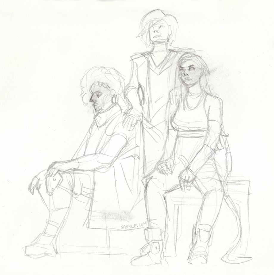
Friends of mine have been hosting figure drawing sessions for a while now, but it’s time to move on. For this last session, not one but three cosplayers were asked to be our models: @kdnaii_, @zephyrean, and @cenikicosplay!
I tried some materials I haven’t touched for years: Winsor & Newton Pigment Markers. I got introduced to them in a workshop by Wouter Tulp when I was still in art school. They work a bit like alcohol markers, though the ink does not run into the paper directly. Because of that, it’s easier to blend while the ink is wet. On the flipside, they do take some time to dry. For figure sketching, you’d better add colours last, because it takes minutes before you can add another layer. Good to know: they do blend waterproof fineliners and ballpoint too!
I remember I found it hard to get used to them, but after playing around with them I’m excided to give them another try, especially in drawings I don’t have to create under time pressure.
When the models posed all three together, I decided to work on a good sketch to finish at home rather than trying to ink it in the 20 minutes too.
And although there are plenty of mistakes in the final drawing, I do like the look of the markers and black ink!
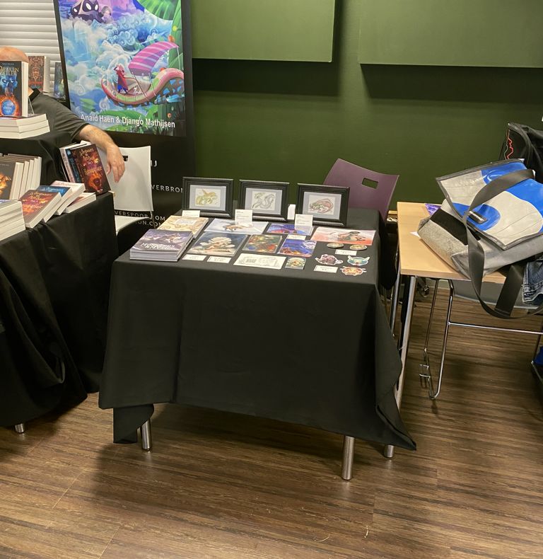
Maybe it’s because the necessity to make money of my creations has waned a bit; I feel I’m starting to like smaller conventions much more than the larger ones. Okay, the smallest I attended where fantasy and sci fi ones, the largest mostly comic-oriented; so maybe it’s not a fair comparison. But what I’m getting at: smaller conventions are so much more relaxed to attend than the larger ones, expecially as a dealer!
It’s been a month already since I attended Fantasticon, the fantasy convention I dubbed the smallest in the Netherlands on my first visit in 2022. This year, I was invited to join a panel about AI in writing and helped behind the bar for a couple of hours. I also tabled with prints and booklets, which would have been impossible to combine at a larger convention. I remember at Dutch Comic Con, during peak times it wasn’t even possible to go to the bathroom; both the visitors demanding your attention as the waiting line made it impossible to leave your booth. Your neighbours would be just as busy so they couldn’t help you out either. And while all those people might drive up sales, it makes the whole experience quite exhausting.
I’d rather stay at the small conventions; where I have the time to chat with other dealers and am able to leave my table unattended for a while. During really quiet times, I can sketch the stand across my table and just do my own thing. Apart from being super relaxing, drawing also sparked new conversations. And in the end, making connections is just as worthwhile, and something I always felt there is little time for at larger events.
I did sell stuff, even though I didn’t dare to hope for it: two booklets, a print and a sticker. Totally not bad for such a small convention!
Will I never attend big conventions like Comic Con anymore? I won’t say never, but probably not in the near future. Bigger means more expensive and most convention ventures up to now ended in the red. Now I don’t need the income anymore, so I can focus solely on the fun.
I realised I never photographed these drawings I made during my last figure drawing session in May 2023. Looking back, I think they are some of the best I’ve made last year!
A few weeks back, a group of friends invited me to go draw at the zoo! I had only once before drawn from live animals in the zoo, so I was very excited to try again.
It was a very warm Sunday, perfect for a visit; though we weren’t the only ones thinking about that! Despite all the screaming kids and crowds, I still feel happy with the drawings I was able to make.
Back in June I attended a figure drawing session organised by The Artist Guild. This session featured Lucid Belle cosplaying as Cammy (Street Fighter 6), a nice change from all the nude models! I never came around scanning the drawings, here they are at last!


