Year: 2016

  • But you were going to do something with climate change, right?

    Yeeeeesh, I am going to do something with climate change. Which involves more research. Last one with no sketches, promise!

    Climate change is an extremely complex topic, as there are so many factors related to each other, and we still do not know exactly how it all comes together.

    An illustration of the complexity:

    It is generally known that greenhouse gases as methane and carbon dioxide are responsible for a rise in temperature across earth. This basically results in the ice in Artica and Antartica to melt. On one hand does this mean there is less white snow and ice to reflect the sun’s light, which will only result in even higher temperatures, like a snowball effect. On the other hand, increase of melting water in the sea dilutes the salt percentage around the poles. This influences the course of ocean current such as the Gulf Stream (which is responsible for Norway having ice-free ports during winter, up to Murmansk in Russia) When the Gulf stream will change it’s course or stop completely (it has in the past), Western Europe might get a much colder climate instead (I mean, we’re on the same latitude as Canada) (1). And then there are other factors I haven’t mentioned yet, such as the jet stream air currents (yes) and the fact that current climate models aren’t able to calculate the effect of clouds yet (2).

    The most ‘likely’ scenarios of climate change leave us with these consequences (3):

    • sealevel will rise (more floods)
    • droughts and wildfires will become more common in most warm places
    • other areas will get more rainfall (including Northern Europe)
    • more extreme weather overall

    More water, more droughts, more extreme weather. Do you think what I think?

    image

    And similarities rise even more when you know that the lines on these guys are inspired by the Nazca lines (mythology)!

    (this is actually not how the story works, Rayquaza stops Groudon and Kyogre fighting each other and represents clear skies rather than extreme weather (it’s Ability nullifies weather effects after all). Groudon and Kyogre created land and sea on the earth, respectively, although they are capable of creating droughts as well as floods. They are not associated with climate change, but I couldn’t help but make the connection! Know what’s out there already, so to say!)

    Floods as well as heat or fires appear in several doomsday myths, so it’s only natural to create a creature representing floods and/or rainfall and a creature representing droughts and/or heat. Originally I also wanted to design a extreme weather creature too but I think that’s too much in the given time. I rather present two well-made creatures than three a-OK for the sake of having three.

    Now let’s start designing! My wrist is already feeling much better, so I should be able to throw out some sketches this week.

    Sources.

    (1) Rahmstorf, Stefan et al. (2005), Exceptional twentieth-century slowdown in Atlantic Ocean over turning circulation, online published in Nature.

    (2) Stocker et al., Chapter 7: Physical Climate Processes and Feedbacks, Section 7.2.2: Cloud Processes and Feedbacks, in IPCC TAR WG1 2001.

    (3) Global Warming Effects Map, National Geographic
  • More Myths

    Sorry, no sketches in this post. I just post it here to be sure I have posted them all on tumblr…

    As mentioned before, the Norse Germanic tribes had also their view on how the world would end, named Ragnarök (loosely meaning ‘destiny of the ruling powers’ or ‘decline of the gods’).

    For the sake of this research, I wrote a very brief summary, as I’m only interested in the large course of events:

    • The first sign is fimbulwinter: three winters without summer, the sun provides no warmth in this period
    • When Ragnarök starts, the sun and moon will be devoured by the wolves Sköll and Hati respectively, the stars fade and the Earth will be covered in darkness. The ground will shudder and mountains will crumble, freeing the wolf Fenrir from his chains.
    • Jörmungandr, described as a sea serpent or dragon, will breach land as the sea violently swells onto it.
    • the Gods fight Jörmungandr, Fenrir and each other to death and the earth is engulfed in flames.
    • the Earth sinks into the sea and will resurface as a new world, with a new man and woman to inhabit it. (1)

    The Maya have been associated a lot with a Apocalypse myth, as in 2012 rumours appeared that their calender would end and therefore the world with it. Though, these rumours have been largely been ungrounded. The Maya calender is based on baktuns, periods of 144,000 days. Around the 23th of December of 2012, the calendar shifted from the 12th baktun into the 13th baktun. There has been no evidence that this change of age would had apocalyptic effects. (2)

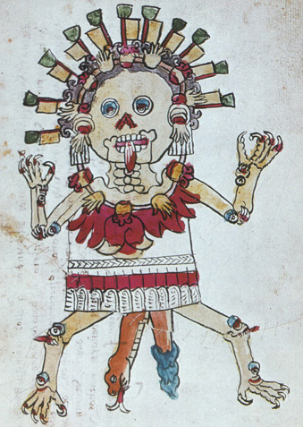
    The Aztecs are also not known to have a true Doomsday myth. This is because the Aztec gods are not separated by being ‘good’ and ‘evil’, these concepts didn’t exist in Aztec myth. (3) The closest thing is the story of female skeleton demons called Tzitzimitl descending to earth during a solar eclipse to eat us poor humans.

    image

    According to Hindu, the world will end when the tenth avatar of Vishnu and Shiva will appear on earth, Kalki. He will appear on a white horse and with a blazing sword (does this sound familiar?).

    Within a large system of ages and years, we live in Kali Yuga, the last of four ages that make up the current kalpa. Kali Yuga lasts for 432,000 years and is characterized by decay, deceit and violence. People will live in sin, following false religions and plagues, famines and natural calamities will appear. (4)

    Sources

    (1) Bellows, Henry Adams (2004). The Poetic Edda: The Mythological Poems. Dover Publications.

    (2) Lopez, Luis Carlos (2012). Mayan Calendar And The End-Of-The-World Explained. Huffington Post.

    (3) Brundage, Burr Cartwright (1979). The Fifth Sun: Aztec Gods, Aztec World. Texas University Press.

    (4) The Vishnu Purana

  • The Representation of Dinosaurs

    Dragons look different all over the world, but dinosaurs looked also very different in the past.

    When Gideon Mantell found the remains of what later became known as Iguanodon in 1820, he first thought of a crocodile. When he took a closer look, it became clear that he had found among other bones the teeth of an ancient reptillian herbivore. Other naturalists first dismissed them as either fish teeth or those of a rinoceros, until they noticed similarity with the teeth of iguana. Mantle gave the creature therefore the name Iguanodon (Iguana-tooth in Greek). In 1834 another incomplete fossil of the animal was found, which lead to the first artistic renderings of Iguanodon. A well-known mistake Mantell made was intrepretent the thumb-claw as a horn, placed on the nose.

    image

    In 1878 coal mine workers in Belgium found what is still the largest Iguanodon finding to date. With 38 individual animals found researchers were now able to construct an almost complete skeleton of the animal. Though, Louis Dollo took wallabies for reference and mounted the skeleton upright as he thought the smaller forearms wouldn’t help to support the weight. In the artistic renderings of that time, one can still very well see the reference to crocodiles.

    It wasn’t until the 1960 that Iguanodon was researched more and researchers now concluded that there was no way that the dinosaur would have walked around like a kangaroo. Its tail just couldn’t bend like that without breaking. Iguanodon was a tetrapod herbivore which could stand for a short period on it’s hind legs, but had to walk on four.

    It was also around that time that other dinosaurs got an ‘update’, for example the widely known Tyrannosaurus was also thought to walk upright when it was found in the early 20th century. In the 1970s researchers concluded that Tyrannosaurus wouldn’t be able to balance its weight when walking upright, and that the tail would be held upright as counterbalance to the enormous head.

  • Art School Project

    This quarter at art school we can theoretically do whatever we want. Theoretically, because we still need to have some sort of concept and idea of what it has to represent of course. I’m immersing myself in the world of creature design, but I don’t have a ‘concept’ yet. -.- I just want to design creatures.

    Anyway, as we need to post weekly blogposts on our school site about our research, I thought I could post them here as well. Seemed nice to share some progress of creatures and monsters, not? I started researching where all these creatures actually come from (or at least the most well known, the dragon).

    Dragons appear in a lot of different myths all over the world. That is, these are all different beasts that we call a ‘dragon’, but when you delve deeper it appears that these creatures actually looked very different. There seems to be one thing they all have in common, though: they all have at least one snake-like feature.

    image

    This does make sense: venomous snakes live all across the world and were a pretty serious threat for people living in ancient times or the Middle Ages. Also think of Satan’s appearance of a snake in the Bible. Snakes are commonly associated with evil (at least in the western world).

    One theory claims that our ancestors might have found dinosaur fossils and thought of the creature where those bones belong to. This is a rather tricky theory though, as there haven’t been found a lot dinosaur fossils around the Mediterranean Sea. Even more interesting, ancient bones were more attributed of heroes of the past rather than giant animals.

    An other explanation says mystical creatures might came to existence through miscommunication and a different cultural reference. The myth of the unicorn could be very well a rinoceros described to a person who hasn’t seen any other large four-legged animals than horses and cattle.

  • Ganon Comic Process Part 2

    I wanted to upload this a few days earlier, but Tumblr had issues. o.0

    After finishing all the drawing (and writing), there was the fun-but-tedious task of arranging them neatly in a booklet! I’m saying fun-but-tedious as I went through many versions and tried out a lot of different things to come up with the final arrangement. I wanted to play around with how the booklet will be read and how I could impose extra meaning in how the panel and text is positioned.

    After printing the first version of the booklet, I used a staples for fastening. Quick and cheap. Originally I was thinking about binding it by hand with linen, but that would just take me far too much time. Still fun, though. I also opted for thicker paper, but the staple had had already a hard time getting through the sketch paper (20 pages!), it would never make it through anything ticker. Oh well. ^^

    image

    Getting the staples exactly in the middle isn’t very easy either. ^^;

    After printing, there were two things that I wasn’t really happy about: all the drawings appeared a little pixel-y and the time transition wasn’t really clear.

    I fixed the slightly blurry drawings by vectorizing ALL the drawings and text, so it would consist of shapes instead of pixels, which makes the printer handle the drawings just like typed text, basically, and super sharp printed. Luckily there are tools for that online, I used www.autotracer.org/. If I had to do it by hand I would still be working on it XD The drawback was that the drawings would lose detail, especially in the really fine hatchings. But I think it is still better than that the drawings were appearing as being low resolution, because they were clearly not. 🙁

    image

    It is much easier to see in real life than on a photograph, but the top image is after I vectorized the drawing, the one at the bottom is the original pixel-y scanned drawing. You can also see the slight loss of detail.

    For the time transition I wanted to use an extra colour, so it would get some extra punch to make it more clear. The whole booklet is actually rather vague, you wouldn’t really get it if one’s not familiar with Ocarina of Time. But I liked it that way, it had to spark that curiosity.

    I chose red for dramatic effect. 🙂 I had thought of using a second colour before, I might wanted to RISO print the booklet, a RISO printer can only print max. two colors at once. When I found out that the booklet was going to be 40 pages I quickly dismissed the idea of RISO’ing this as it would be far to much work.

    image

    The first test with some red in it: I just painted with ecoline (ink) over the first test print I did to see what worked.

    image

    Second test print I did to test the vector drawings and new placement of text and image.

    image

    Final spread! I painted the red shapes on a separate paper with ecoline and scanned them in. Tricky, because I kind of had to guess to get the right shape! I wish ecoline worked on transparent paper too…

    I also used red for other parts of the story, as you have seen already: 😀

    image

    All in all, I improved my inking skills, especially hatching, so mission accomplished! It’s even so bad that I’m sure I could do many of the earlier panels better. Still, I’m too lazy to draw them again, I’d rather move on to a new project. It’s been to long for this one, more than a year even! But I’m very happy that I committed myself to do this and I’m really happy with the end result!

    image
  • Ganon Comic Process Part 1

    As promised!

    When I finished Ocarina of Time I immediately started working on it, which was in June 2015. I wanted to get all the drawing done for September, but I only managed to finish the couplet, which caused me to drag on the refrain in-between school assignments until January or so. I’m almost ashamed to admit it took me almost two years to finish it, as it is in no way a really big project of some sort… I just wanted it to be perfect, haha.

    I started by drawing a storyboard. I already had a lot of ideas what to show at which words, so I drew what I thought could work on separate papers and played around until I had the best combination story-wise.

    Pretty messy, as you can see. This won’t land me a position as Pixar’s lead storyboard artist, haha! 😀

    As soon as I got the storyboard ready, I started to drawing out the panels. I wanted to do this with black fineliners to practice my inking skills. I’m saying panels instead of illustrations because I saw this thing as a comic, later to be published in a booklet, rather than just sitting on the internet. The lyrics would be under or next to the panels.

    The text needed to be hand drawn, too. I didn’t want to create a real font, that would be too much hassle. People work on fonts for months, if not years to create something great. I just wanted some hand drawn looking text. And it would be cool if it resembles Hylian writing, so I tried blocky shapes with a lot vertical and horizontal lines. The first sketches were a bit too blocky, as they started to look like early computer fonts. So I put in more curves. And then, the tedious act of writing all the text by hand. You bet I know the lyrics now by heart! lol

    In retrospect creating a font wouldn’t be hassle at all: I discovered www.myscriptfont.com that quickly converts your handwriting into a fully usable font. Oh well. I might create a font anyway. 

    Stay tuned for part two! 😉

  • Why This Comic

    Only one week left of these black and white panels, and then it’s done already! I didn’t notice until a few days ago that November is actually Zelda Month (for YouTuber PeanutButterGamer at least), a perfect coincidence! If I noticed before I would have planned this comic so that it would also start November 1st, but with Inktober I just always forget about November being Zelda Month. Oh well.

    Anyway, only one week left, today we’re gonna start with the refrain of Vida La Vida. I thought it would be nice if I share my motivation for this project, along with some process which I will post in the following days. 🙂

    I got the idea for this when I had been playing Ocarina of Time for a few months or so. I suddenly realized that the lyrics of Coldplay’s Vida la Vida fitted Ganondorf’s situation very well.

    If you’re not familiar with the lyrics, the couplets go like this:

    I used to rule the world
    Seas would rise when I gave the word
    Now in the morning I sleep alone
    Sweep the streets I used to own


    I used to roll the dice
    Feel the fear in my enemies eyes
    Listen as the crowd would sing
    Now the old king is dead, long live the king

    At that point I was obsessed enough to hear storyline clues and character motivations in every song, but this one fitted perfectly if you asked me. ^^ For me, the lyrics tell Ganon’s part of the story of Ocarina of Time. This was December 2014 if I remember correctly. I forbade myself to start working with this idea before I finished the game, so I would know exactly what happened to Ganon, what is shown and what is implied, what is told and what is not told.

    When I finally finished the game (June 2015), I was fascinated how it all came together in the end. And also how Ocarina of Time as a game fits as a keystone into the whole timeline. It might not be the greatest of stories but I loved it and I still do. What hit me when I heard Vida la Vida was how tragic Ganondorf’s obsession with power actually is.

    Even though I haven’t grown up to this game (I was three when it came out), it feels special to me. Heck, I didn’t even know it existed before 2011 till the 3DS version came out! I’ve played the original version from 1998, and of course are the graphics horribly outdated, it still has a very nostalgic feeling to me. I would even say it has some timeless appeal. The graphics might be dated, the polygons might be countable, the music might sound tinny, and I’m probably biased as hell, but no, it’s true this game is something special. And I just had to express that. 🙂

  • Life Updates

    I haven’t been really active for a while because there are so many things going on now.. School has started again two weeks ago, and first of all, I’m in my 3rd year now, which means I’m a senior student! One year and a half and I’m graduating and I don’t feel ready for that at all!

    Thinking about that, I discovered that a lot of illustrators do have a side job to have enough income. Or at least I suspect it, after reading a few books and such… It’s at least eye-opening because I always thought felt you either make it or your don’t in this business, and if you don’t you’re a loser.. But getting clients and contacts and promoting yourself take a lot of time, if not money, so it makes sense that you have other ways of getting money, before you actually start living from your art…

    Back to the project we’re working on right now. Luckily for me, the theme about this quarter is game design, so I can finally use and train the skills I’d want to use in the future! Unfortunately, the team I’m in is quite a diverse mix of personalities and we have a hard time deciding what to do and how we’re gonna present it.. So either it turns out great or we will fail miserably. I feel we’ll get into a fight at each other at least once during this project, if not soon. :/

    And then there is the Portfolio Night on the 12th of October! All kinds of professionals and studios and companies will visit and I have the chance to show them my work… Which means you have to make the best impression! With lots of good works to show! I have such an hard time picking artworks that are worth showing.. 🙁

    But let’s end all this stressful talk with a happy note: if everything goes well, I’m going on exchange next February! That means I will be spending four months at UMPRUM in Prague! Yay! 😀

  • Back from Vacation to the Baltics

    The reason there weren’t any posts for the past three weeks: holidays. To Latvia and Estonia, to be precise, and a one-day trip to St. Petersburg. 🙂

    If you ever to to St. Petersburg (or Moscow), go eat at Теремок (Teremok)! It’s a Russian fast food restaurant, although I can’t say it’s really fast food you’re getting. You can choose between soups, buckwheat and many different blini (Russian pancakes) with meat and vegetables and potatoes or fruit or chocolate. Delicious! And so much better than the McDonalds which is everywhere. >.>

    On the way home I suddenly realized how terribly designed my country is – the landscape in Latvia and Estonia isn’t that different at first sight, it’s almost as flat as the Netherlands but with lots and lots of forest. But in a country bigger than mine but with a population that’s less than a tenth from here, there is so much space and nature, it shows it is really different. In the Netherlands, every single square cm has been planned and designed, every field, hill, dike and ditch is man-made. Look at aerial photographs and it’s a checkboard pattern of fields and ditches. Heck, we even create land out of water! I never fully realized that until now.

    Another thing I noticed, I feel the people are much closer to nature in Latvia and Estonia. We’ve seen multiple times people collect berries and mushrooms in the forests during our hikes. In the Netherlands there are very little people who do that, even though there are plenty blackberries and raspberries to pick here too. The people who do pick berries are mostly Polish immigrants XD. Some even think it’s weird. Thing is, these plants mostly grow on municipal grounds, so it’s also there were people walk their dogs and the like. I even think it’s illegal – same as it is actually illegal to pick flowers from the roadside when they were planted by the municipality. >.<

    Anyway, I’m glad to be back home. 🙂

    Too bad school starts in two weeks.